Burger King is rebranding with a retro look
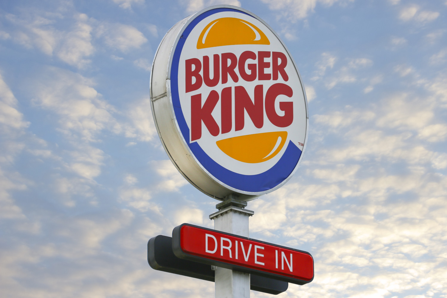
Fast-food favorite Burger King, which was founded in 1953, is starting 2021 with a whole new look — the company’s first brand redesign in 20 years. The new identity includes a new logo, packaging, restaurant merchandise, menu boards, uniforms, restaurant signage and decor, plus social media, digital and marketing assets.
Designed by the agency Jones Knowles Ritchie, the redesign has a retro vibe, both in its color palette (with its dominant hues of mustard and burnt orange) and the custom font called “Flame,” reported CNN.
The company celebrated its “new profile pic” on social media with a tweet that read, “out with the old, in with a new classic.”
out with the old, in with a new classic #NewProfilePic pic.twitter.com/y2eRT9qqO6
— Burger King (@BurgerKing) January 7, 2021
According to Lisa Smith, executive creative director at Jones Knowles Ritchie, who collaborated on the design with Rapha Abreu, vice president and global head of design at Restaurant Brands International, part of the reason for the change is to make Burger King’s brand design more functional and legible on digital platforms.
Another big goal was to emphasize fresh ingredients in an industry that doesn’t exactly enjoy a reputation for offering healthy food.
“We wanted to use design to close the gap between the negative perceptions people have of fast-food and the positive reality of our food story by making the brand feel less synthetic, artificial and cheap, and more real, crave-able and tasty,” Smith told Fast Company.
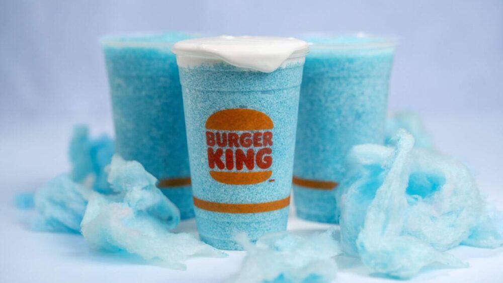
The result is a departure from the previous logo with its circular blue swish around a burger icon, which had been used since 1999. In its place is a flat, cartoon-style burger with “Burger King” between the buns.
Jones Knowles Ritchie shared images of the new logo and materials, including staff uniforms, on their Twitter page.
What was the strategic insight? Wrong answers only. pic.twitter.com/EiPZvHsgpS
— Jones Knowles Ritchie (@jkrGlobal) January 7, 2021
The redesign was well received on social media, with Mitch Goldstein, associate professor at New York’s Rochester Institute of Technology’s College of Art and Design, describing it on Twitter as “the right way to do a rebrand.”
In response to those who commented that the new logo looked like a previous Burger King logo (used from 1969 to 1999), Goldstein wrote that it may be an update of an older logo, “but it is INTENSELY Burger Kingy. It has maximum possible Burger Kingosity. It could not be for anything else.”
https://twitter.com/mgoldst/status/1347308342692245506
Although the new identity will be rolled out right away in ads and on packaging and signage, it’s likely to take several years before every restaurant is renovated. After all, there are nearly 19,000 Burger King locations around the world.


